Kleinburg Brewery
- design
- / web
seo // December 11, 2020
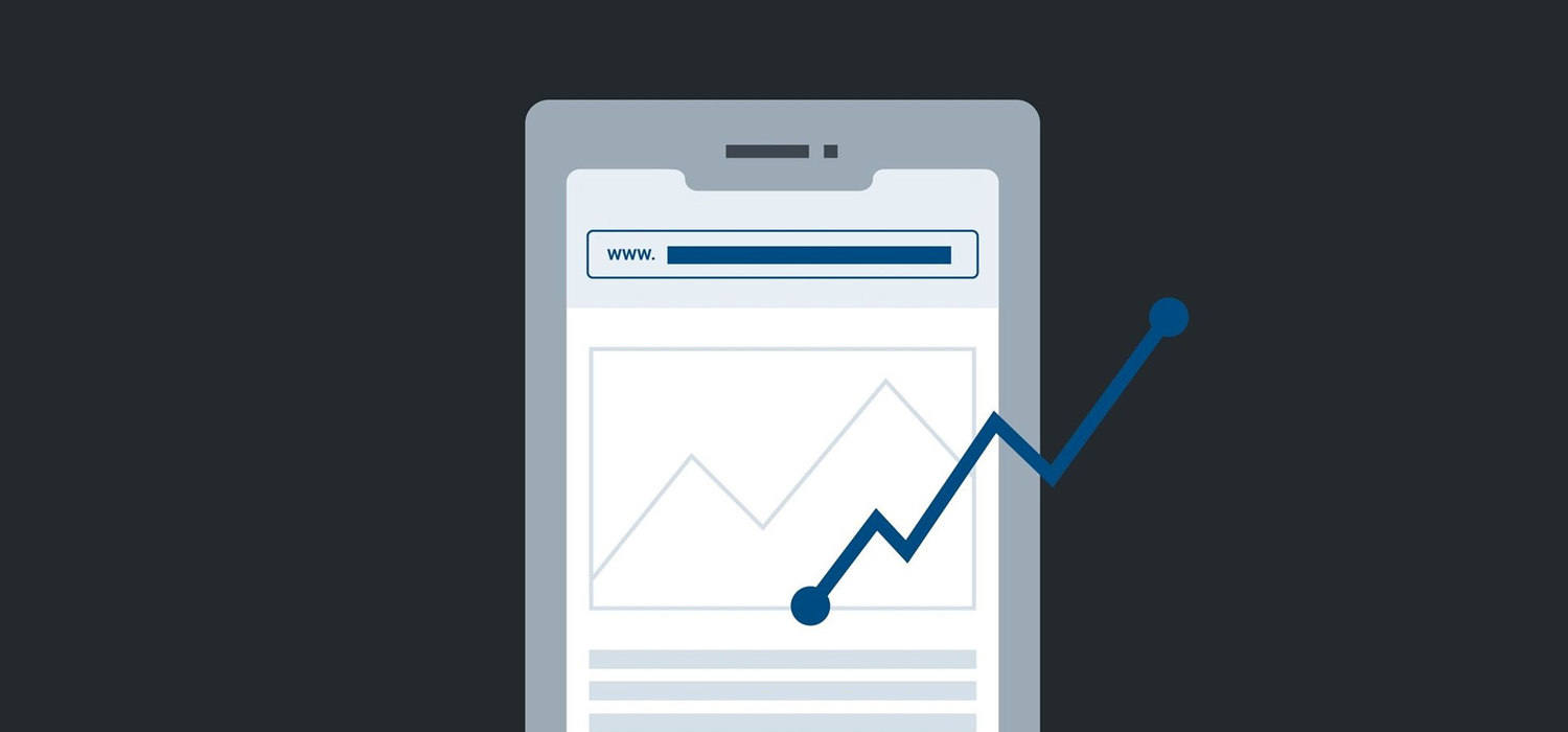
Did you know that people check their phones 58 times a day on average? Yup, you heard that right…58 times! There is no way someone is going on their laptop or desktop 58 times a day, which means mobile devices like phones and tablets are what we’re using most nowadays. More and more people have started to search and shop online using their phones, so your site better be mobile-friendly if you want any kind of traffic.
Remember when we talked about digital maturity a couple of blogs ago? (Click here if you missed it!) Well, having a mobile site that works effectively on phones and tablets shows that your business has some digital maturity, which is what we are all striving for to become successful online!
A well-designed mobile site can ultimately help increase sales and boost revenue for your e-commerce site. Having a responsive, engaging site that works properly is essential for any business, but what else can make your mobile site more user-friendly and ultimately increase sales? Well, keep reading to find out!
Simplicity can truly do wonders when it comes to your mobile site because of the limited space. But it can become challenging when it comes to e-commerce sites as they have a ton of product content that needs to fit in a small area and still function properly. This is where simplicity comes into play! Make sure there is an appealing amount of negative space when displaying products; this will keep things clean and clear. Try using Photoshop to display products on blank white backgrounds, emphasizing the inventory and creating enough space between each item. Users will then have to click on the products that appeal to them, showing the description and price on a new page – how easy is that!
Since we’re discussing simplicity, it’s important to have an easy and quick checkout. Make the checkout experience as simple as possible so users will want to purchase an item without any frustration. Nothing is more annoying than a 20-step checkout process that is confusing and elaborate. Use a maximum of 4-steps and limit the amount of typing necessary; these pages need to be as simple as the rest of your site. Using type boxes that predict what the user is looking for can be extremely helpful as mobile users want things done quickly. Also, providing the option of guest checkout is a great way to allow users who don’t have an account or can’t remember their password to checkout. Make sure there is also an option to save their information for next time; this will keep people coming back and making more purchases on your site!
Hamburger navigation menus not only have a great name but are incredibly useful for mobile sites because of the lack of space. A hamburger menu refers to the three stacked lines in the corner of a site that, when clicked, open the full navigation menu (and, yes, they’re called hamburger menus because the three lines resemble a hamburger – isn’t that fantastic?). These are ideal for mobile sites as there is no room for a full navigation menu across the top. Your hamburger menu should be off to the side where it’s not in the way, yet large enough to stand out. If you have multiple product categories, don’t be afraid to take up the whole screen with your navigation menu, as this allows users to navigate through your site with ease!
One thing to keep in mind when it comes to navigating your site is the home page – make sure there is always an easy way for users to get back to the beginning. Navigating through a site can get confusing at times, so it’s crucial that users feel they can start from the first page again. The best way to do this for mobile is by using your company’s logo. Users can easily click on your logo and get redirected back to the home page, allowing your logo to always be present on your site while keeping users happy.
Nobody is a fan of the zoom in and scroll every two seconds just to read something. When people go on their phone to visit a site and see tiny text that is near impossible to read…they are not going to stay very long, let alone purchase anything! You’ll need to think strategically about your fonts and their sizes – think large, simple, and bold! Also, think about how much content you need on your mobile site. Too much content won’t fit on the screen, forcing you to simplify your text and keep things concise. No one goes on an e-commerce site to read paragraphs and paragraphs about products. Short and sweet tends to do the trick, benefitting your business as a whole in the long run!
You know when you go to a website on your desktop, and a pop-up appears? You either read it and close it or just close it as soon as you see it (because we were busy doing something, stop bugging us!). Isn’t that same pop-up even more annoying when we’re on our phones, and it feels impossible to close the damn thing? Please, whatever you do, do not be “that website.” On a desktop, this can be an effective way to sell a promotion or point the user to a new product. However, on mobile, it should be avoided like the plague! Pop-ups on mobile are usually very difficult to close because the ‘X’ is too small, or it takes up the entire screen with no way of getting rid of it. This is a huge deterrent as users get frustrated and move to the next site that doesn’t annoy them. So, at all costs, do not have pop-ups on your mobile site if you want more revenue.
Our last tip is essential for building trust with your users/customers. Trust not only gets people to buy your product or service, but it keeps them coming back again and again! The problem with mobile purchases is that people don’t feel their information is secure and, therefore, won’t make the purchase, ultimately killing your conversions. So, how can you make your customers feel safe and secure on your site? By having an SSL security certificate (the small lockbox next to your site’s IP address in the toolbar). If you don’t have one, you’ll need to purchase one. Even if you don’t have an e-commerce site, it’s important to have one as you want users to feel safe while browsing.
However, some people are set in their ways and will not make any purchases on mobile devices. In this case, make sure your site has the option for users to save a product for later or email it to themselves. This way, you can secure more sales no matter what device they decide to use. Look at your mobile site as a research/browsing page and make multi-channel use easy and accessible for your customers.
Using multiple platforms is essential for your business to thrive in the digital world and boost sales. We encourage you to continue your research and keep learning while you stay tuned for our next blog!
Contact UV Designs today to help with your company’s digital transformation. We can help your business thrive in the digital world!