Kleinburg Brewery
- design
- / web
seo // June 07, 2021
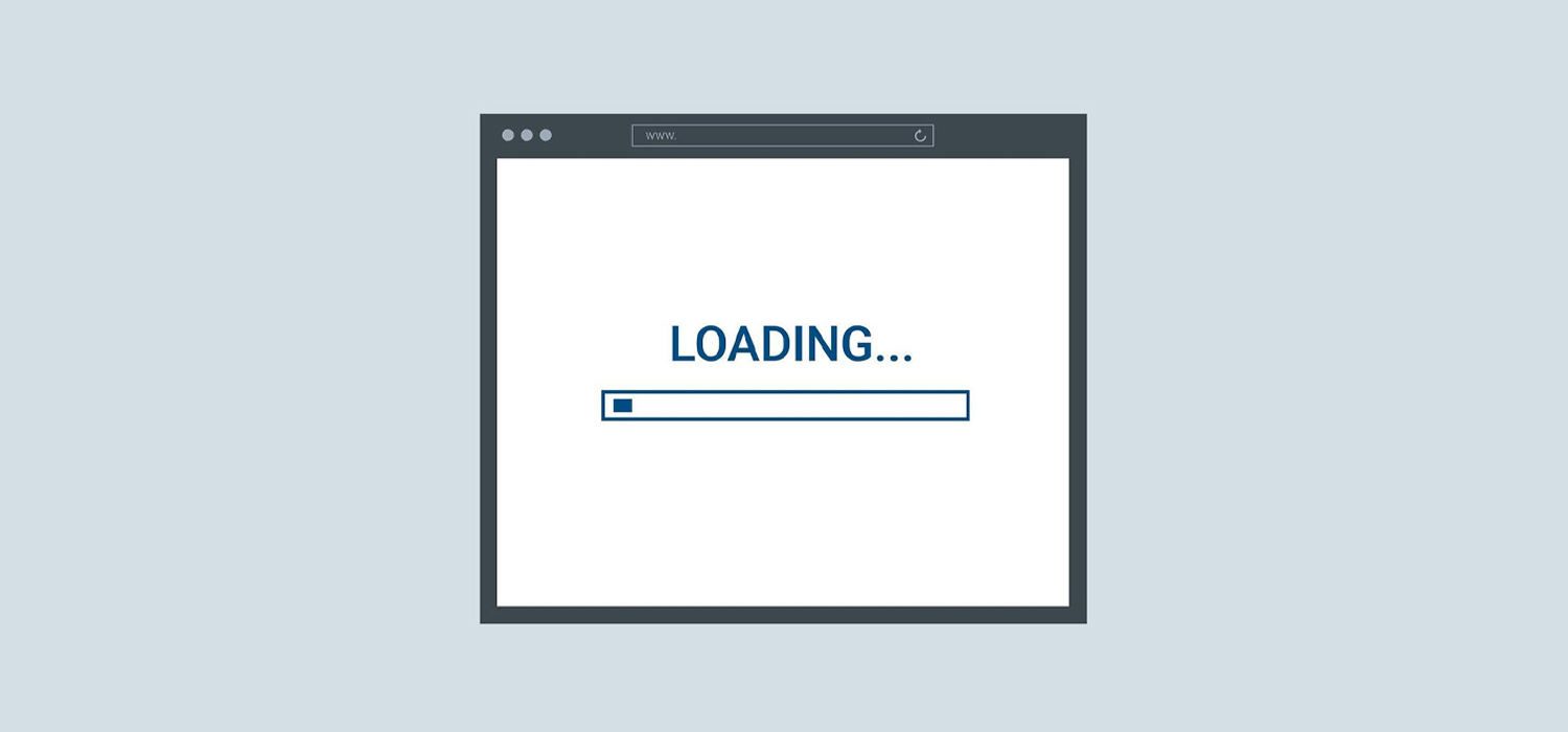
Consider that 93% of people say they’ve left a website because it didn’t load properly on their device.
That shows just how important the design of your user interface (UI) is.
If visitors can’t use your site properly, they’ll simply go elsewhere.
But what elements of your UI design are the most impactful? Which has the largest effect on keeping your visitors on your site and converting?
Read on to learn exactly what you need to do to improve your UI design to stop your customers from abandoning your site.
According to web designers, the top two reasons people redesign their websites are low conversions and high bounce rates.
This makes sense since 90% of visitors have left websites because they were badly designed.
If your UI design isn’t up to scratch, not only will you see high bounce rates, you’re not going to see the conversion rates you’d like. You simply won’t close sales.
This is because poor UI design makes it hard for users to navigate your site. This leads to interaction friction.
Interaction friction is when any part of the user interface prevents a customer from reaching their end goal. Too much interaction friction and customers get frustrated, causing them to abandon your site altogether.
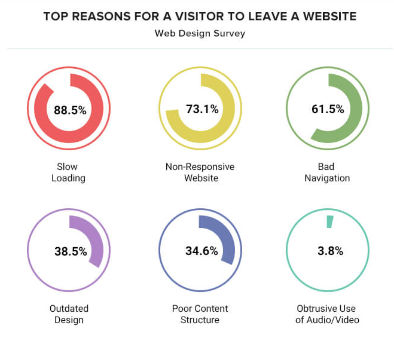
According to web design agencies, the top reasons that visitors abandon your website are:
Read on to learn how to improve your UI design so that you don’t run into these risk factors.
If you notice that customers are leaving your site and conversion rates are down, it may be time to explore your UI design. It’s likely that your visitors are struggling to use the website.
Here are some impactful ways to improve the UI design to reduce abandonment rates.
A consistent colour palette is not only pleasing to the eye, but it also helps lock your brand’s identity into your user’s mind.
More than 18% of marketing and branding professionals say that a brand’s visual identity is its key differentiator. This is why one in five brands are increasing their branded content, with 54% of organizations investing more in branded content than they ever have previously.
On your website, your colour palette is your first port of call when it comes to establishing your visual identity through branding.
Think about brands like McDonald’s or Coca-Cola. Their brand colors provide distinguishable backdrops that assure customers they’re in the right place and add an air of professionalism.
But it’s not just your website you should be concerned about — it’s your UI design across all platforms.
More than 12% of branding professionals are worried about a lack of branding consistency.
Consistency in your colour palette should be apparent across all of your UI designs, including your website, app, and social media pages. This fluidity puts confidence in your users that they’re in the right place and interacting with the right brand.
Take PandaDoc, for example.
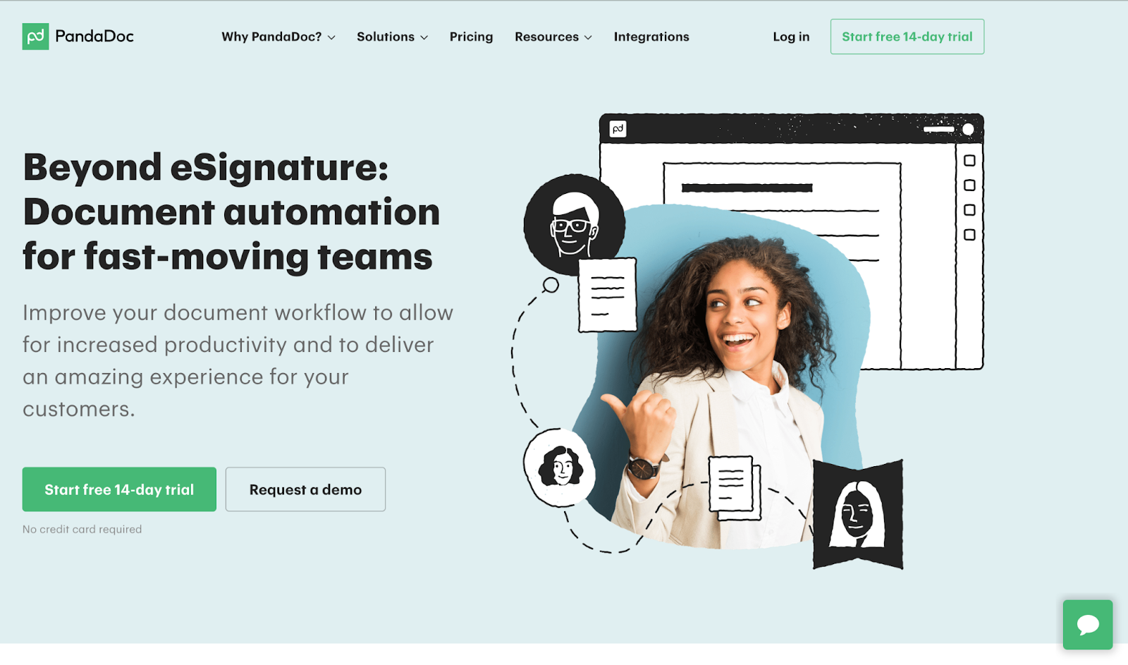
It’s green, black, and white colour palette is used to create a modern, easy-to-read design on its website.

This same colour palette is reflected in its social media design.
According to 84% of web design agencies, the most common web design mistake is overcrowding. One in five say it’s a poor use of whitespace.
If your UI design is cluttered with lots of features, it becomes hard for users to understand how to navigate your site and what to pay attention to.
The use of whitespace is exactly what it sounds like. It’s how you use white space to bring clarity to your website design so that users know where to look, where to click, and what to focus on.
Take a look at this article about credit repair companies, for instance.

The clever use of whitespace design reduces clutter and draws your attention to the important elements: the text, the share buttons, and the profit-making pay-per-click adverts.
By using whitespace in this way, visitors are more likely to carry out the actions that the website wants them to, like clicking the adverts or sharing content.
While 61% of web designers say that bad navigation is the top reason visitors leave a website, more than 30% claim that hidden navigation is the most common web design error they come across.
Your navigation design is what makes it easy for your visitors to reach their end goal. If users don’t know where to go to find what they need, they’re going to get frustrated and choose a competitor.
If you find that you’re getting lots of visitors, but they’re bouncing without converting, you need to analyze your user journey to make sure navigational elements are clear.
Have a look at your menus to make sure they’re intuitive. Visitors should be able to find what they need logically.
When on each page, make sure it’s clear where users need to go next to achieve their goals.
Pay special attention to your call-to-action buttons. It should be clear what users need to click on to complete the next action in the customer journey.
Take a look at Medical Alert Buyers Guide, for example.

The main navigation menu has logical categories, which drop down to show subcategories to aid further navigation.
Remember, neat navigational organization doesn’t just help visitors move around your site — it also helps Google rank your content correctly.
Nowadays, 64% of traffic comes from mobile devices.
There’s nothing more frustrating than using a mobile device to access a website, only to find that it’s not mobile-friendly. What we mean by that is the text is too tiny to read, the buttons are too small to click, and elements seem to run off the page.
That’s why 73% of web design agencies agree that the number one reason users leave sites is because they’re non-responsive.
When it comes to UI design, it’s not enough to simply have a great desktop website — you need stellar mobile design too.
This means everything from large call-to-action buttons to fully optimized mobile forms.
Think clearly about how visitors use your site on mobile platforms. It’s not the same as a desktop, as they’ll be using their hands to click buttons rather than a mouse.
Plus, you need to consider how elements should be resized to fit the screen and still remain clearly visible.
It’s especially important to think about decluttering the page. While you can fit lots on a desktop web page, there’s significantly less room on a mobile page. Reduce clutter so that you can guide mobile users to the important elements without overloading smaller screens.
More than a quarter of web designers say that bad typography is a mistake made by most small businesses when designing their websites.
Bad typography covers a lot of ground. This could include fonts that are hard to read, outdated styles, and confusing spacing.
One major problem, however, is when the font makes it difficult to understand the structure of the text.
Hierarchical typography is one of the best ways to make your text clearer, so your audience can immediately understand how website and blog content is structured.
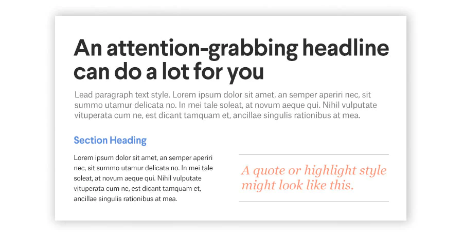
Hierarchical typography refers to the practice of using specific fonts and font sizes for each purpose within the content.
Your headlines should be in the boldest, largest font, followed by your subheadings. Secondary subheadings should be larger and bolder than tertiary subheadings and so on.
Your main body text should be easy to read, relatively plain, and smaller than your signpost text (your headings).
Quotations should also get their own font style to differentiate them from the main body text and headings.
By doing this, readers find it simpler to navigate through your text web pages.
It’s not enough to set it and forget it.
UI design trends change frequently. Right now, your visitors may like minimalist designs with good whitespace use and strong navigational signposts, but these trends could fade out over time.
This leaves your site looking outdated. Up to 38% of web design agencies agree that outdated design is one of the top reasons people click off websites.
This means you need a quality management system to regularly assess and improve your UI design.
Quality management can take many different forms.
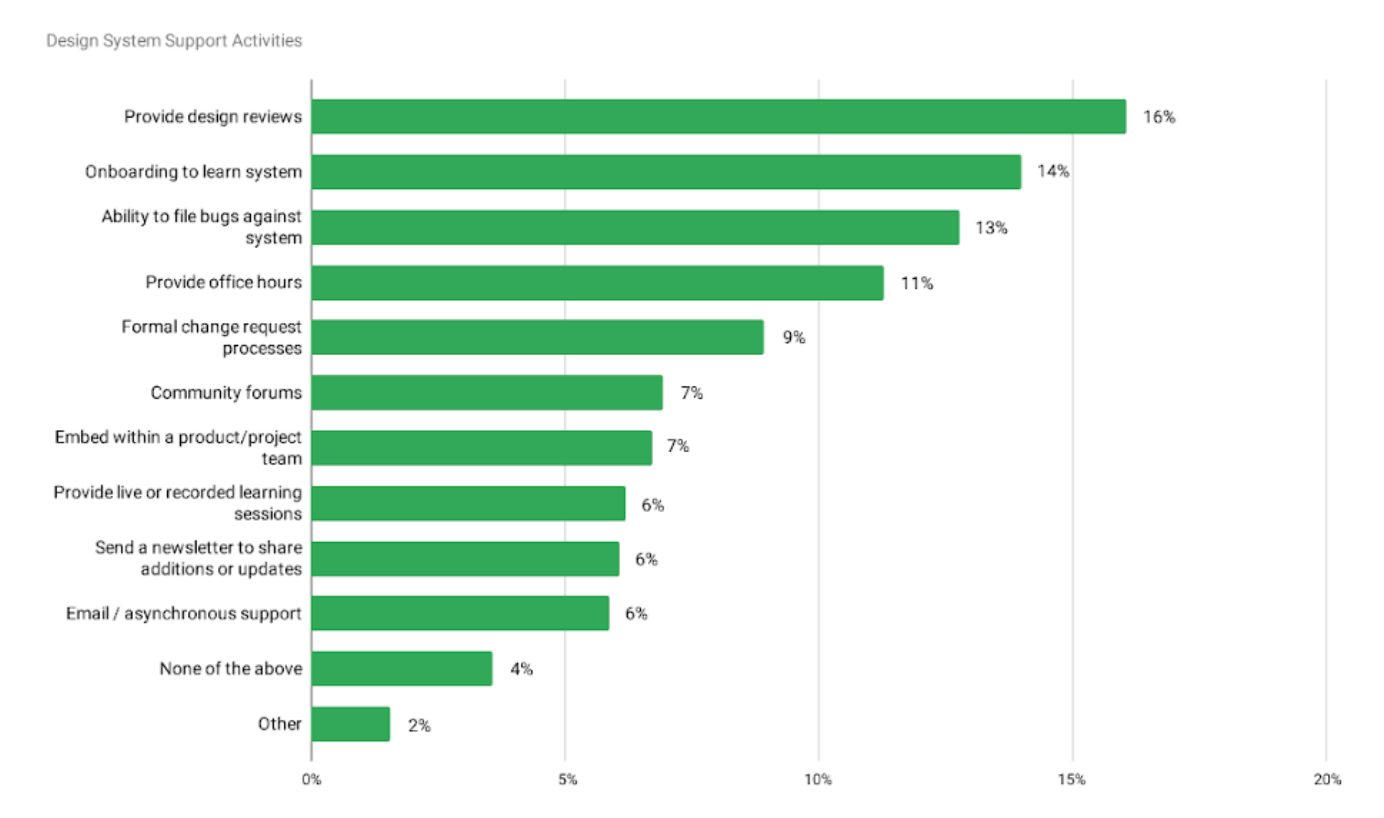
To ensure quality management, 16% of designers provide design reviews, while 9% invite formal change requests, and 7% hold community forums.
You could also ask customers for feedback using surveys. Try A/B tests to get some real-time insights.
Intuitive UI design makes the difference between a confusing user journey and a high conversion rate. If your visitors are abandoning your site, you need to start asking questions about your UI design.
It’s important that your UI design is clear and minimalistic to avoid cluttering the page. Otherwise, visitors will find it tough to work out how they navigate toward their end goal.
If you need more help creating fluid UI design that encourages conversions and prevents website abandonment, it’s time to talk to the experts at UV Designs.

Ray Hein is the CEO and founder of Propel, a cloud-based product success platform. He is a SaaS veteran with 20+ years of PLM, development and product launch experience in both hardware and enterprise software organizations. Ray has held multiple executive positions at companies such as Agile Software, Apttus, Vendavo and Centric Software.